It is usually curators who select particular pieces to put into a display, to tell a story or present common themes. For example, the Wilberforce House Museum in Hull, has many different mediums to communicate and educate the public, such as free MP3 downloads on their website, which are suitable for adults and children. It is a multi-sensory experience with colour aids and audio guides for orientation around the exhibition. There are also Animateurs, who communicate historical facts in an engaging way for the young audience.
The Usher Gallery is just finishing exhibiting Transmitter/ Receiver: The Persistence of Collage, which I visited today. The aim of my visit was to look at the labelling and layout of the exhibition in particular.
The labelling was close to the pieces, unlike the white cube aesthetic which was inspired by the minimalist modernism. Instead I found that the labelling of this exhibition was not overpowering, although black text on white, and I put this down to the sans serif type used, which was much softer.
My favourite piece in the exhibition was Mark Titchner's The Invisible Republic, 2006. Inkjet on vinyl. The description read: Made for the It Is You exhibition at the Arnolfini, Bristol in 2006, The Invisible Republic exemplifies all the hopes and ideals of today's culturally overly- aware society. Taken from corporate mission statements, the text is relentless in its demanding of improvement, potential, and collective contribution towards a better future for the viewer. Titchner makes a wry comment on the state of art today, and its position within our commercial society.
I don't think I've ever considered how much work and thought goes into producing such an exhibition, involving multiple design fields to collaborate, such as Interactive Design (how the audience move through the space), Informative Design ( organises the presentation of content) and Sensorial Design (Lighting, colour, sound and movement). Graphic designers also have to work with certain constraints, such as, a budget, the attention span of the audience, possible policies of word counts, the exhibition space and the genre and style of the gallery.
Contextual E-file, recording progress of work within Lincoln's Graphic Design Degree
Showing posts with label collage. Show all posts
Tuesday, 2 October 2012
Design for Exhibitions
Location: West Midlands, England, UK
The Collection, Danes Terrace, Lincoln, Lincolnshire LN2 1LP, UK
Tuesday, 25 September 2012
First Studio Session
As a get to know each other starter, we were asked to draw the person opposite. Whilst this was going on, groups were making 6 stills into a small animation with objects that express your personality.
This piece was to collage with brown paper the person opposite, I chose to pick out her most prominent features and kept it very minimal.This was a tonal piece, picking out the darker tones.
And then we were given many different characters in various types to make the face. I found this quite difficult.
Location: West Midlands, England, UK
Lincoln, Lincolnshire LN6 7BP, UK
Friday, 30 December 2011
Linda Marie Young
Linda Maria Young's designer boxes are luxuriously made for special occasions such as weddings etc
I like how it closes.
I then enlarged my net by 100% and cut it out of card, laid strips of collaged typography down and sealed with PVA.
Final box, colourful and fun.
Wednesday, 28 December 2011
Letters
Letter A,
Alphabet
Peter Blake, 2007
demonstrates his passion for collecting letters and imagery.
Shutters
Ben Eine, 2002- 2007
Made transition from guerilla graffitti to commissioned compositions
The Bastard Word
Fiona Banner, 2006-7
Images of fighter planes
Mapplethorpe Alphabet II
Amandine Alessandra, 2009
Vinyl gloves, a scanner and key means of communication, her hands
Alphabet of caught fish
Joanne Young, 2009
Forlorn fish which have been skewered by peculiarly shaped fish hooks. Grotesque tone as fish not hooked conventiallu through the lip.
Exclamation Point, from Exclamation Point, Comma and Question Mark
Andrea D'Aquine
Explores the imagined personalities and neurosis of various punctuation marks. Surreal images which maintain a darkly comic tone. Similar to David Shrigley and Edward Gorey.
My collage of imagery of the letter 'o', never ending and constant
Alphabet
Peter Blake, 2007
demonstrates his passion for collecting letters and imagery.
Shutters
Ben Eine, 2002- 2007
Made transition from guerilla graffitti to commissioned compositions
Alphabet for Alphaville
Scott Tepin, 2008
One storey urban dwellings which are animated with futuristic fantasy.The Bastard Word
Fiona Banner, 2006-7
Images of fighter planes
Mapplethorpe Alphabet II
Amandine Alessandra, 2009
Vinyl gloves, a scanner and key means of communication, her hands
Alphabet of caught fish
Joanne Young, 2009
Forlorn fish which have been skewered by peculiarly shaped fish hooks. Grotesque tone as fish not hooked conventiallu through the lip.
Exclamation Point, from Exclamation Point, Comma and Question Mark
Andrea D'Aquine
Explores the imagined personalities and neurosis of various punctuation marks. Surreal images which maintain a darkly comic tone. Similar to David Shrigley and Edward Gorey.
Happiness is a Warm Gun
Matthias Ernstberger, 2005
Poster was part of a series documenting punctuation symbols, where each symbols was celebrated on a poster created by a different designer. Ernstberger was given the apostrophe, whose job it is to eliminate letters. Hence he chose to represent this with a revolver.My collage of imagery of the letter 'o', never ending and constant
Monday, 19 December 2011
Collage Workshop
Early Cubists
George Braque and Pablo Picasso started to experiment with collage with 1912, using it as a background surface.
Above: Braque's Fruitdish and Glass, papier colle and charcoal on paper, 1912
George Braque and Pablo Picasso started to experiment with collage with 1912, using it as a background surface.
Above: Braque's Fruitdish and Glass, papier colle and charcoal on paper, 1912
Above: Picasso's Bottle of Vieux Marc, Glass, Guitar and Newspaper, 1913
Juan Gris was influenced by their work and took the process further by rubbing a wooden table to show the grain.
Above: Gris' Breakfast, 1914
During the 20s and 30s only used collage to explore textural qualities.
Kurt Schwitters' Merz 1921
Schwitters' Merz Building took shape between 1920 - 1936 - altered whole room with collage and lived in the space for several months.
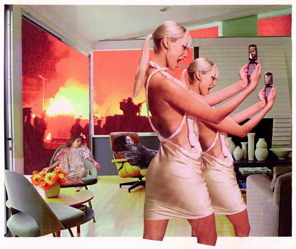
During the Pop Art era of the 60s, Robert Rauschenberg used everyday imagery from newspapers and magasines, transferring them onto collage. Juxtaposed images for the viewers' own interpretation.
Rauschenberg's Retroactive I, 1964
Rauschenberg's untitled, 1954
Collage evolved with the digital age into photomontage, as artist increasingly used photoshop etc.
Hannah Hoch's Cut with the Kitchen Knife through the Beer-Belly of the Weimar Republic, 1919,
Martha Rosler's Photo-op, 2004
David Mach
John Stezaker
Chris Ofili's No woman, no cry - in response to the murder of Stephen Laurence, portraying the tears of the victim's mother
Sunday, 23 October 2011
Experimental Weaves
Weaving together images from magazines, larger strips and so sections are less distinguishable.
I tried another with tighter sections so that the figure is more distinguable.
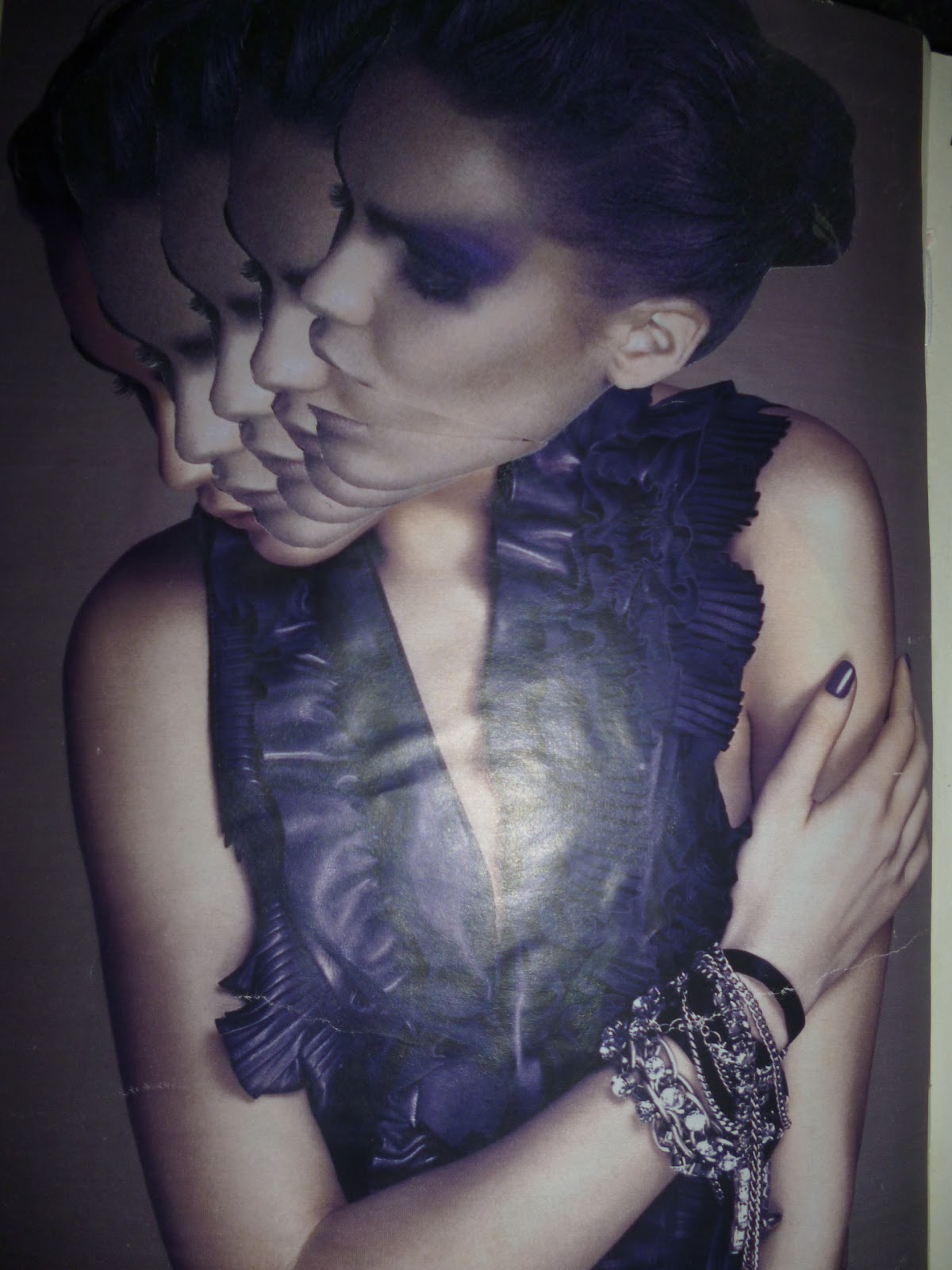
Continuing Eun-Sil Han's method of layering the head and cutting the jaw open, gives a element of comedic hilarity.
Influenced by Stezaker's 'Underworld', I used collage to give an impression of the subject's personality. I used flowing yellow material to show her happy disposition and a butterfly to show her youthfulness.
Influenced by Draxler, I laid strips of paper down, I like the stretched effect. I also like the subject's expression of shock as if she can feel being stretched.
I tried another with tighter sections so that the figure is more distinguable.
Using my own image: tighter weave, with 2 images at slightly different angles so that weave is slightly distorted.
Continuing Eun-Sil Han's method of layering the head and cutting the jaw open, gives a element of comedic hilarity.
Influenced by Stezaker's 'Underworld', I used collage to give an impression of the subject's personality. I used flowing yellow material to show her happy disposition and a butterfly to show her youthfulness.
Artist Research
Dave McDermott- Devil Music, 2010
Much like weaving McDermott layers old photos which I really like.
My interpretation. I photocopied the image and cut out circles, building up the layers. I really like this method.
Eva Eun-Sil Han- Untitled 2010
Like McDermott, the image is stuttered and layered, by using the small to larger size, it gives the end product a more dynamic finish.
My interpretation. I also cut open the mouth to evoke a more dynamic feel. This is reminiscent of Terry Gillium's monty python animations. Now I've used images from magazines to experiment with, I will use my own imagery.
Much like weaving McDermott layers old photos which I really like.
My interpretation. I photocopied the image and cut out circles, building up the layers. I really like this method.
Eva Eun-Sil Han- Untitled 2010
Like McDermott, the image is stuttered and layered, by using the small to larger size, it gives the end product a more dynamic finish.
My interpretation. I also cut open the mouth to evoke a more dynamic feel. This is reminiscent of Terry Gillium's monty python animations. Now I've used images from magazines to experiment with, I will use my own imagery.
Artist Research
10th September
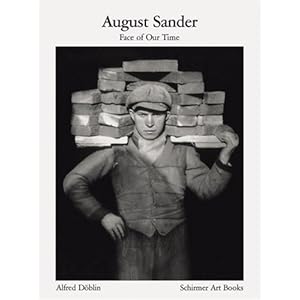
August Sander -Face of Our Time
Sander produced black and white portraits in a documentarian style in Germany, during the Great Depression. However, unlike Paul Trevor's study in the 1970's there is a real feeling of desperation and poverty.
John Stezaker
Also produced portraits but with a twist. By using collage, his work became dynamic and more telling. For example, (below) Love XI 2006, the extra strip of her eyes make the subject seem to be blinking, giving a flirtatious element to this attractive woman. I really like this way of enhancing a person's personality or mannerisms by using collage.
August Sander -Face of Our Time
Sander produced black and white portraits in a documentarian style in Germany, during the Great Depression. However, unlike Paul Trevor's study in the 1970's there is a real feeling of desperation and poverty.
John Stezaker
Also produced portraits but with a twist. By using collage, his work became dynamic and more telling. For example, (below) Love XI 2006, the extra strip of her eyes make the subject seem to be blinking, giving a flirtatious element to this attractive woman. I really like this way of enhancing a person's personality or mannerisms by using collage.
Thomas Hirschhorn- No life is Cheap, 2001
Also uses collage to show his disgust towards the poverty and famine which is present worldwide. Using aggressive marks with a red marker, the central female figure appearing to weep blood. The repeated phrase ' 1 MAN = 1 MAN' echoes his message.
Donna K- A Walk is a Series of Steps, 2008
The circular background with the figures merged into a central dial makes the piece more dynamic, as if they could be spinning round. this could symbolise change and time. Such as the young children growing into a young adult, ready to see the world.
James Gallager- Domestic 1, 2010
Uses vintage images and does not show the face in his collage. is showing how a woman may lose her identity as a housewife, a slave to her husband and home.
Lilliana Pereira- Old school: Anatomy 2007
This collage may be a interpretation of a woman's anatomy,depicting the female figure as divine. But the words 'superficial veins' may suggest this beauty is only skin deep.
Tara Hardy- The Warrior, 2010
shows how the modern woman has to be a warrior and fight with her brain, supported by imagery of pens instead of bullets, the birds may represent freedom in this new independence.
Ingrid Baars- Kiki, 2009
This digital collage presents its audience with quite graphic and vivid imagery. Which in turn explores the figure's sexual charge.
Subscribe to:
Posts (Atom)