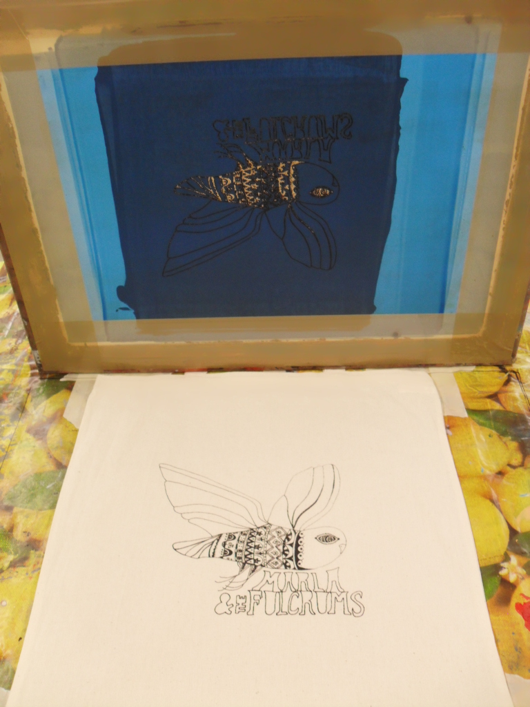
I had to measure my bags and the screen to find the centre and line them up. I started by printing black.
Here is my first sample, I thought the ink came through a little heavy, to combat this I found that if the paint was mixed equally with printing medium and quickly skimmed across the screen the image came out clearer.
Two of my bags printed in black.
Green samples. I chose an emerald earthy green to tie in with my poster and the folky theme.
Blue samples, this was to tie in with the festival poster.
Brown Prints, this was to continue the earthy theme.
I randomly plodged on brown and green paint, this gave an interesting merge of the woody theme. I am very happy with the 18 bags I have successfully printed and the feedback i have recieved has been very positive.
Contextual E-file, recording progress of work within Lincoln's Graphic Design Degree
Showing posts with label Printing. Show all posts
Thursday, 31 May 2012
Bunting Samples
I had to experiment with tension and needle size to determine how I wanted my knitted flags to look.
For the doile flags, I PVA'ed the cut edge so it would not fray or snag threads.
Here is a sewn sample of the flags I plan to include. I want to keep the colour scheme minimal and focus on the texture and methods used. The first is a hemmed calico flag, with lino cut printing on to it. There is also the doile and knitted flags. I do however intend to increase the size.
This is a sample of the typographic flags i plan to use, at first I used just a piece of material but this looked unexciting and too 2D so I wadded up my second attempt which made it look better. My lettering will have serifs and I plan to use calico.
For the doile flags, I PVA'ed the cut edge so it would not fray or snag threads.
Here is a sewn sample of the flags I plan to include. I want to keep the colour scheme minimal and focus on the texture and methods used. The first is a hemmed calico flag, with lino cut printing on to it. There is also the doile and knitted flags. I do however intend to increase the size.
This is a sample of the typographic flags i plan to use, at first I used just a piece of material but this looked unexciting and too 2D so I wadded up my second attempt which made it look better. My lettering will have serifs and I plan to use calico.
Monday, 28 May 2012
Tshirt and bag design put onto a screen
My screen has finally came back but I can't start printing until half term because Katie Jarvis is still printing on the large table and I need a large area to secure my tshirts and bags.
Final Draft of My Vinyl Cover
I reproduced my vinyl cover to give a better finish, from the range of designs I made, my client liked this one the best. Originally, I was going to use my own imagery for the photographic elements, this however proved to be difficult, as there were many variables working against me. Such as: the weather, the time I had left and the location of such a shot.This considered I went onto Google images and sourced the above image of Morton Arboretum woodland from Wikipedia. This obviously is not ideal, in reality though, Graphic Designers don't have the luxury of time to collect their own images, the internet is a valuable resource and as long as no copyright is infringed.
Wednesday, 25 April 2012
T shirt and bag design
Fineliner, I kept the owl silhouette and added a folk style design that I found on Pinterest. Because this design is going onto the t shirts and bags, I had to think about sizing and positioning of the writing. I swapped it from the top of the wings to underneath the illustration. I intend to send this design to a professional printhouse to have it put onto a screen, so that I can have a good clean finish for my prints
This was the image I found so inspiring and it originates from New York artist, Thaneeya McArdle's blog
Finished Illustrative Vinyl idea
Practise printing lino onto a photocopy to make sure can line up. I chose the ink colour as it ties in with the muted tones of the branches and leaves.
Finished Illustrative Vinyl Cover, Slightly less smooth print due to raised surface of emulsioned background. All things considered I'm very happy with the result.
Monday, 23 April 2012
Lino Circular Title
Having trouble keeping the lettering tight for 'Marla', too spaced out
Need to bunch it together, initial sketch
Measured out lettering
Traced out onto lino, will cut out tonight ready for printing tomorrow on illustrative vinyl idea
Need to bunch it together, initial sketch
Measured out lettering
Traced out onto lino, will cut out tonight ready for printing tomorrow on illustrative vinyl idea
Wednesday, 18 April 2012
Initial Vinyl Cover Designs
Illustrative, layered lino printed, largely inspired by Mark Hearld
Photographic, cut out, screen printed, largely influenced by Miike Snow's debut album
Friday, 23 March 2012
Screen Printing Tester
I put together this tshirt design, and hand screen printed it onto various surfaces, such as cartridge paper, sugar paper, cardboard, tyvek, calico etc. I took inspiration from this image on Pinterest:
Monday, 12 March 2012
Saturday, 3 March 2012
Lino printing
I began my album cover art by making the design, which i would combine with a photograph. Variants of this could also be used on tshirts, album covers etc. Just as i had started my lino cutting, i realised i had but the lettering on the wrong way. Restarting Monday.
Sunday, 26 February 2012
Clare Rojas
Lives and works in San Francisco, illustrator and writer of children's books


Screen-reader users, click here to turn off Google Instant.
Friday, 24 February 2012
Lesley Barnes
Animator/illustrator from Scotland. Click here for her blog.
Belle and Sebastian's I didn't see it coming, animation
Belle & Sebastian's tour poster, produced by strawberryluna
Subscribe to:
Posts (Atom)


