Showing posts with label Typography. Show all posts

Tuesday, 25 September 2012

Defining Critique Seminar


Defining Critique 
  • informed analysis or evaluation
  • formal and structured 
  • specialist vocab
  • may consider intentions and outcomes in relation to common conventions e.g. genre
  • generic convergence, unless package looks as if belongs to category might get overlooked.
Analysis = breaking into parts 
  • in terms of various elements and aspects 
  • generic criteria 
  • how its made
  • why does it look like this? what was the brief? measure outcome against intention
Architecture of a page
  • Golden section, grid more aesthetically pleasing, better proportions 
  • layout and typeface 
Typeface: Purpose and Personality
  • Ikea's switch from Futura to Verdana causes stir among typography geeks (2010)
Why does it look like this?
  • capture design decisions, formal analysis, include professional terms 
  • constraints set by brief, what parameters have they followed 
  • what conventions are followed?
Meanings and values 
  • What are the meanings of consumer or user - ideal or actual
  • what are the connotations?
  • How did the product draw on consumers culture? 
  • 'Cultural baggage' what does it tell you about its culture 
Paracetamol- blue and white themed packaging - soothing and conventional

Alfred Roller, Session, Poster 1902 
  • Utility & Coherence
  • Pictorialism and animation of lettering 
  • Period feel - Art Nouveau, but reusable
  • Almost illegible, lettering using organic forms, distinct aesthetic look


Modernism, letters as figures in space, some locked and some seemingly floating, such as the work of Max Ernst, Piet Zwart (above)and Neville Brody 

Saul Bass, The Man with the Golden Arm, Poster 1955. Influenced by the the blocks of colour from abstract paintings. It was the era of the american, cool, jazz, skyscraper aesthetic, very aspirational.
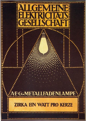
Peter Behrens, 1907 designed the AEG factory in Berlin, various electrical products and the corporate look, which is still an icon of modern design today.

El Lissitzky, Beat the whites with the red wedge, Lithographic Poster, 1919. Revolution of Communism in Russia.

Extra Reading:
http://www.designcouncil.org.uk/about-desing/Types-of-design/Packaging-design/Graphics
Ambrose, G., 2003. This End up; Original Approaches to Packaging Design.
Hove: Rotovision.
Calver, G., 2003. What is Packaging Design?
King Gordon, S., 2005. Packaging Makeovers: Graphic Redesign for market Change. Gloucester, 
Mass: Rockport
Stewart, B., 2007. Packaging Design. London: Laurence King.  

Sunday, 3 June 2012

Bauhaus at the Barbican

The Bauhaus was a radical art school that was based in Germany between 1919 and 1933. It was started by architect Walter Gropius and had other artistic directors - Hannes Meyer and Mies van der Rohe. The school encouraged the development of all types of art and design, from architecture to textiles, furniture to typography, graphics to products and of course painting and sculpture. It's designs look fresh and contemporary after all this time. Modern designers are still inspired by it's work and ethics. The idea of 'form follows function' was certainly embodied in the work of the Bauhaus. The school was eventually closed by the Nazi regime, as free thinking artistic types did not fit in with Hitler's plans.
The Barbican in London will be staging a major exhibition from 3rd May to 12th August entitled 'Bauhaus: Art as Life'. There will be endless sources of inspiration there, no matter what your chosen discipline. It costs £7 for students if you book on line, £8 on the door. I hope to visit this exhibition before I start University in September.

Monday, 28 May 2012

Tshirt and bag design put onto a screen

My screen has finally came back but I can't start printing until half term because Katie Jarvis is still printing on the large table and I need a large area to secure my tshirts and bags.

Final Draft of My Vinyl Cover

I reproduced my vinyl cover to give a better finish, from the range of designs I made, my client liked this one the best. Originally, I was going to use my own imagery for the photographic elements, this however proved to be difficult, as there were many variables working against me. Such as: the weather, the time I had left and the location of such a shot.This considered I went onto Google images and sourced the above image of Morton Arboretum woodland from Wikipedia. This obviously is not ideal, in reality though, Graphic Designers don't have the luxury of time to collect their own images, the internet is a valuable resource and as long as no copyright is infringed.

Wednesday, 9 May 2012

A1 poster attempt

Flyer from Moseley Folk Festival 2012

 Marbled paper, unfortunately this surface was too wrinkled to successfully work into.

I found it difficult to cut into, i will try and resolve this issue by using stretched paper instead.


Thursday, 3 May 2012

Second Poster

Pencil sketch of second poster proposal, inspired by Mosely Folk Festival's poster

I chose this poster because I liked the antiquey style and the centralized composition.

 Experimental marbling paper, sprinkling ink into a tray of water and then laying the paper on top. I thought this would give an interesting background for the second poster idea, which is the festival featuring the band.

 I used the marbled paper and cut out part of my design, i feel that this worked well but the serifs on the font were difficult to cut out. For my final design, i need to marble the paper and then stretch it to stop it from crinkling.


Experimenting with different coloured backgrounds.

Wednesday, 2 May 2012

Band Poster

A3 draft for band poster

A1, water coloured branches and moved the owl further down to give a cleaner and balanced composition.

Using a Fine liner, gave emphasis to serif lettering and printed two sizes of lino cut leaves to continue illustrative theme used on the vinyl.

Monday, 23 April 2012

Lino Circular Title

 Having trouble keeping the lettering tight for 'Marla', too spaced out

 Need to bunch it together, initial sketch

 Measured out lettering

Traced out onto lino, will cut out tonight ready for printing tomorrow on illustrative vinyl idea

Wednesday, 18 April 2012

Initial Vinyl Cover Designs

Illustrative, layered lino printed, largely inspired by Mark Hearld

Photographic, cut out, screen printed, largely influenced by Miike Snow's debut album

Friday, 23 March 2012

Screen Printing Tester

I put together this tshirt design, and hand screen printed it onto various surfaces, such as cartridge paper, sugar paper, cardboard, tyvek, calico etc.  I took inspiration from this image on Pinterest:


Monday, 12 March 2012

Lino Printing


Experimenting with lino print. Final design for vinyl art work

Saturday, 3 March 2012

Lino printing


I began my album cover art by making the design, which i would combine with a photograph. Variants of this could also be used on tshirts, album covers etc. Just as i had started my lino cutting,  i realised i had but the lettering on the wrong way. Restarting Monday.

Wednesday, 22 February 2012

Yulia Brodskaya

Driven by a passion to unite typography with illustration with typography, developed a unique style that embraced paper cutting and folding to bring a type to life. Click here for her website.


Wednesday, 1 February 2012

Noah and the Whale

Noah and the Whale are an English indie folk band from Twickenham, London, England formed in 2006


Poster- bright and imaginative subject


Life goes on