Showing posts with label University. Show all posts

Tuesday, 25 September 2012

Defining Critique Seminar


Defining Critique 
  • informed analysis or evaluation
  • formal and structured 
  • specialist vocab
  • may consider intentions and outcomes in relation to common conventions e.g. genre
  • generic convergence, unless package looks as if belongs to category might get overlooked.
Analysis = breaking into parts 
  • in terms of various elements and aspects 
  • generic criteria 
  • how its made
  • why does it look like this? what was the brief? measure outcome against intention
Architecture of a page
  • Golden section, grid more aesthetically pleasing, better proportions 
  • layout and typeface 
Typeface: Purpose and Personality
  • Ikea's switch from Futura to Verdana causes stir among typography geeks (2010)
Why does it look like this?
  • capture design decisions, formal analysis, include professional terms 
  • constraints set by brief, what parameters have they followed 
  • what conventions are followed?
Meanings and values 
  • What are the meanings of consumer or user - ideal or actual
  • what are the connotations?
  • How did the product draw on consumers culture? 
  • 'Cultural baggage' what does it tell you about its culture 
Paracetamol- blue and white themed packaging - soothing and conventional

Alfred Roller, Session, Poster 1902 
  • Utility & Coherence
  • Pictorialism and animation of lettering 
  • Period feel - Art Nouveau, but reusable
  • Almost illegible, lettering using organic forms, distinct aesthetic look


Modernism, letters as figures in space, some locked and some seemingly floating, such as the work of Max Ernst, Piet Zwart (above)and Neville Brody 

Saul Bass, The Man with the Golden Arm, Poster 1955. Influenced by the the blocks of colour from abstract paintings. It was the era of the american, cool, jazz, skyscraper aesthetic, very aspirational.
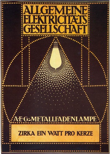
Peter Behrens, 1907 designed the AEG factory in Berlin, various electrical products and the corporate look, which is still an icon of modern design today.

El Lissitzky, Beat the whites with the red wedge, Lithographic Poster, 1919. Revolution of Communism in Russia.

Extra Reading:
http://www.designcouncil.org.uk/about-desing/Types-of-design/Packaging-design/Graphics
Ambrose, G., 2003. This End up; Original Approaches to Packaging Design.
Hove: Rotovision.
Calver, G., 2003. What is Packaging Design?
King Gordon, S., 2005. Packaging Makeovers: Graphic Redesign for market Change. Gloucester, 
Mass: Rockport
Stewart, B., 2007. Packaging Design. London: Laurence King.  

First Studio Session

As a get to know each other starter, we were asked to draw the person opposite. Whilst this was going on, groups were making 6 stills into a small animation with objects that express your personality.
This piece was to collage with brown paper the person opposite, I chose to pick out her most prominent features and kept it very minimal.

 This was a tonal piece, picking out the darker tones.

And then we were given many different characters in various types to make the face. I found this quite difficult.

Sunday, 23 September 2012

Saturday, 25 August 2012

Summer Brief for incoming First Years

The Graphic Design department at Lincoln University has set its first years a summer brief which has been devised to exercise conceptual, graphic, planning and making skills.


Project title: 'Reliquary'
Consider the term Reliquary and its possible conceptual extensions.
 
Part one:
Construct two cubes (one to fit inside the other). The first cube must be precisely 18.3cm on all edges. The second 'cube' should exactly fit, and slide with precision, into the first cube and you should size it accordingly to accomplish this. (Note because of this you may not have an exact cube i.e. all sides equal). You should consider carefully how the inner 'cube' might be easily removed from the outer cube. (The inner cube should glide smoothly out of the first, if you are really good at 'making' you may have to make a small air vent in the outer cube to facilitate this).
Both cubes should have a lid. This should hinge, slide, lift, rotate or otherwise open to reveal their contents of the cubes. (You may have to modify the dimensions of the inner 'cube' to accomodate the outer cube's lid). The materials you choose to construct the cubes are left to you (I would suggestcard or foam board, but the choice is really up to you) however both cubes should be of the same material and construction. All corner angles should be exactly 90 degrees. All edges should be neatly finished and glued. The wall thickness of the cubes is entirely your choice.

Part two:
Inside the inner cube, place an item of significance. This may be a physical, conceptual or metaphysical item, (an idea, aspiration, or philosopy, for example).  If it is a conceptual or metaphysical item, how will you represent this? The outer and inner cubes should not be left plain. Consider the contents of the inner cube and modify the surface of the outer cube accordingly. Similarly modify the surface on the interior of the inner cube. These surface modification could be via typography, image (drawn, printed, photographed, collaged), colour, texture etc.

Considerations:
Typography, Colour, Layout, Line, Pattern, Image, Relief, Positive, Negative Collaged, Printed, Drawn, Digital, Photography, 2D/3D, Crafted, Inventive, Subtractive, Additive, Printed, Embossed, Decoupage, Space, Playful, Conceptual, Philosophical, Intelligent, Speculative, Ambitious, Contemporary, Retro, Political, Social.

Some 'Brainfood' and nourishment:

D&AD
Eye Magazine Flickr
BBC Radio 4
BBC News

Museum of Modern Art

White Cube Gallery

Finally:
Whatever your conceptual and design choices, make your work with love and care, and make it the best that you can do.

Tuesday, 6 March 2012

Art Foundation chums :)

I'm having a great time in foundation and the people are a great group. Everyone is so supportive and considerate, helping everyone else. I shall miss you guys at uni xx

Tuesday, 14 February 2012

GBH design and advertising agency

The tutor who interviewed me at Derby Uni suggested I look at the design and advertising agency, GBH, who are committed to solving communication problems within brand identity, and print advertising etc.


Recent Puma campaign imagery. I like this company's way of working, instead of branding just the products, they brand the customer's experience. I think this is the future of graphics, and it will naturally overlap with other subjects.
My first interview is today at Derby, a little nervous is an understatement, i just hope they get my ideas :/


Tuesday, 10 January 2012

UCAS

I'm so excited that I have an Interview with the University of Derby on the 14th February at 1:30pm :D woop woop!!!