It is usually curators who select particular pieces to put into a display, to tell a story or present common themes. For example, the Wilberforce House Museum in Hull, has many different mediums to communicate and educate the public, such as free MP3 downloads on their website, which are suitable for adults and children. It is a multi-sensory experience with colour aids and audio guides for orientation around the exhibition. There are also Animateurs, who communicate historical facts in an engaging way for the young audience.
The Usher Gallery is just finishing exhibiting Transmitter/ Receiver: The Persistence of Collage, which I visited today. The aim of my visit was to look at the labelling and layout of the exhibition in particular.
The labelling was close to the pieces, unlike the white cube aesthetic which was inspired by the minimalist modernism. Instead I found that the labelling of this exhibition was not overpowering, although black text on white, and I put this down to the sans serif type used, which was much softer.
My favourite piece in the exhibition was Mark Titchner's The Invisible Republic, 2006. Inkjet on vinyl. The description read: Made for the It Is You exhibition at the Arnolfini, Bristol in 2006, The Invisible Republic exemplifies all the hopes and ideals of today's culturally overly- aware society. Taken from corporate mission statements, the text is relentless in its demanding of improvement, potential, and collective contribution towards a better future for the viewer. Titchner makes a wry comment on the state of art today, and its position within our commercial society.
I don't think I've ever considered how much work and thought goes into producing such an exhibition, involving multiple design fields to collaborate, such as Interactive Design (how the audience move through the space), Informative Design ( organises the presentation of content) and Sensorial Design (Lighting, colour, sound and movement). Graphic designers also have to work with certain constraints, such as, a budget, the attention span of the audience, possible policies of word counts, the exhibition space and the genre and style of the gallery.
Contextual E-file, recording progress of work within Lincoln's Graphic Design Degree
Tuesday, 2 October 2012
Design for Exhibitions
Location: West Midlands, England, UK
The Collection, Danes Terrace, Lincoln, Lincolnshire LN2 1LP, UK
Tuesday, 25 September 2012
The Sweeney
After seeing The Sweeney, directed by Nick Love, last night at the cinema, which tells the story of a hardened detective in the notorious Flying squad of London's Metropolitan police. Based on the '70s Uk hit TV show featuring John Thaw and Dennis Waterman.
Defining Critique Seminar
Defining Critique
- informed analysis or evaluation
- formal and structured
- specialist vocab
- may consider intentions and outcomes in relation to common conventions e.g. genre
- generic convergence, unless package looks as if belongs to category might get overlooked.
Analysis = breaking into parts
- in terms of various elements and aspects
- generic criteria
- how its made
- why does it look like this? what was the brief? measure outcome against intention
Architecture of a page
- Golden section, grid more aesthetically pleasing, better proportions
- layout and typeface
Typeface: Purpose and Personality
- Ikea's switch from Futura to Verdana causes stir among typography geeks (2010)
Why does it look like this?
- capture design decisions, formal analysis, include professional terms
- constraints set by brief, what parameters have they followed
- what conventions are followed?
Meanings and values
- What are the meanings of consumer or user - ideal or actual
- what are the connotations?
- How did the product draw on consumers culture?
- 'Cultural baggage' what does it tell you about its culture
Paracetamol- blue and white themed packaging - soothing and conventional
Alfred Roller, Session, Poster 1902
- Utility & Coherence
- Pictorialism and animation of lettering
- Period feel - Art Nouveau, but reusable
- Almost illegible, lettering using organic forms, distinct aesthetic look
Modernism, letters as figures in space, some locked and some seemingly floating, such as the work of Max Ernst, Piet Zwart (above)and Neville Brody
Saul Bass, The Man with the Golden Arm, Poster 1955. Influenced by the the blocks of colour from abstract paintings. It was the era of the american, cool, jazz, skyscraper aesthetic, very aspirational.
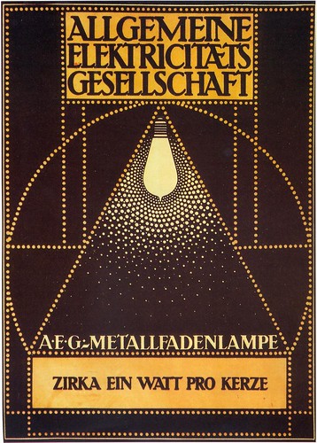
Peter Behrens, 1907 designed the AEG factory in Berlin, various electrical products and the corporate look, which is still an icon of modern design today.
El Lissitzky, Beat the whites with the red wedge, Lithographic Poster, 1919. Revolution of Communism in Russia.
Extra Reading:
http://www.designcouncil.org.uk/about-desing/Types-of-design/Packaging-design/Graphics
Ambrose, G., 2003. This End up; Original Approaches to Packaging Design.
Hove: Rotovision.
Calver, G., 2003. What is Packaging Design?
King Gordon, S., 2005. Packaging Makeovers: Graphic Redesign for market Change. Gloucester,
Mass: Rockport
Stewart, B., 2007. Packaging Design. London: Laurence King.
First Studio Session
As a get to know each other starter, we were asked to draw the person opposite. Whilst this was going on, groups were making 6 stills into a small animation with objects that express your personality.
This piece was to collage with brown paper the person opposite, I chose to pick out her most prominent features and kept it very minimal.This was a tonal piece, picking out the darker tones.
And then we were given many different characters in various types to make the face. I found this quite difficult.
Location: West Midlands, England, UK
Lincoln, Lincolnshire LN6 7BP, UK
Subscribe to:
Posts (Atom)


